InTurn Case Study
InTurn was created by a team of graphic design students that had trouble finding internships. The mission behind this app was to help students find the right internship without the difficulty of searching for one. We designed this app to be accessible to people with visual impairment. I designed the user flow, our competitive analysis, the body copy, and managed our project.
Year: 2021
Duration: 1 Month
Tools Used: Adobe XD, Miro
Process Overview
- User Personas
- UX/UI Analysis
- Wireframes
- Color
- Typography
- Color and Type Testing
- Prototype
- Protoype Video
- Sitemap: Business and Student
- User Flows
User Personas
UI Analysis
In this chart, we examined five different apps to see which user interface features were most popular. We conducted a competitive analysis of Fiverr, Indeed, LinkedIn, ZipRecruiter, and GlassDoor. Our team analyzed their color scheme, shape, font, logo type, and the graphic space used over the course of their apps. Our research found that blue, green, and orange were the most commonly used colors, as well as the shapes used are rounded rather than angular. The majority of internship/job finding apps used a sans-serif font and a logo with a word mark. Further, most apps used centered space instead of a horizontal space.
UX Analysis
In this chart, we analyze the user experience of internship/job search apps. We examined the same five apps we examined previously. Most of the common features include templates, search filters, a messaging system, internship listings, a favorites page, bottom navigation, and an onboarding program.
Color & Type
We chose these colors as they represent the most commonly used color palettes at universities, and have enough contrast that visually impaired individuals can still see them. The typeface we selected for this project is Roboto, which meets the ICDE's accessibility guidelines and is easy to read for those who are visually impaired.
Color Testing
My teammate tested the color palette to make sure that it had enough contrast for each visually impaired types.
According to the ICDE White Paper, “the Y tristimulus value represents the relative lightness to the mind’s eye, or how efficient the eye is in converting light into a luminance sensation” and “the visually impaired need a color contrast differential (CCD) of a minimum 40 between two colors or hues.”
In summary, the Y Tristimulus and CCD are linked by the amount of contrast that exists between each hue.
Type Testing
A member of my team tested Roboto's font weights against backgrounds from our app's color palette. The font had been tested to ensure that it was readable by people with 20/20 vision and 20/70 vision.
Sitemap
Student
The sitemap shows the overview interface of the student's view. In order to use the app, the user must be a student at a university or college. Users can sign up via email or one click with Apple, Google, or Facebook. Users can browse their home page to view their accounts, notifications and messages, or search for internships and jobs.
Business
The sitemap shows the overview interface of the business's view. In order to use the app, the user must verify they are a business by using their business email address. Users can sign up via email or one click with Apple, Google, or Facebook. Users can browse their home page to view their accounts, notifications and messages, search for interns or create job listings.
User Flow: Student
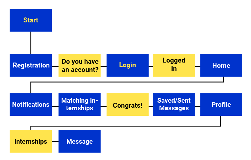
In this user flow, a student is logging into their existing account. Their goal is to check if they have been matched with a company for an internship. Upon clicking their notifications, they find out they've been accepted as an intern at the company.
An acknowledgement and congratulations message appears, followed by a redirect to their inbox. To connect with the company, they check their profile for the internship and message the company.
User Flow: Business
In this user flow, an existing business is logging into their account. Their purpose is to post job advertisements and find new interns. After logging in, they are taken to the home page. The user then creates a new job listing on their own profile and submits it.
Afterwards, the user returns to their homepage to search for interns. With filters, users can choose a field of work, a location, and an industry. Upon submitting the filter fields, they see a potential candidate and message to invite them as an intern.
Wireframes
Student Version
The following screens illustrate different stages of the onboarding process. The first screen is where the user first lands, greeted by the logomark.
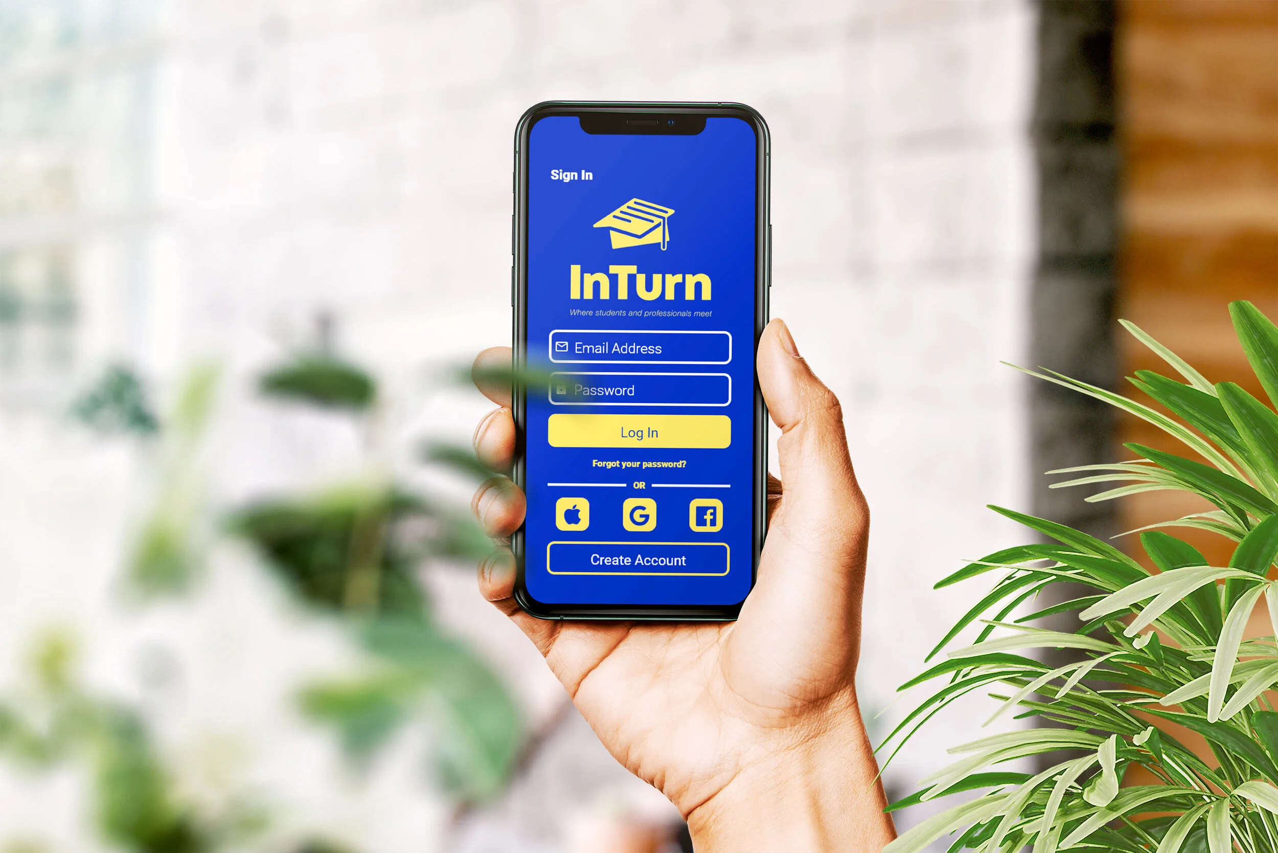
The second screen is the registration page, where users can choose how they wish to register: via email, Google, Apple, or Facebook. The existing user can login using the same login methods by pressing login on the top left corner.
The third screen is displayed after an account has been created. The user can choose whether they are a business or a student. The user is then required to verify their email that corresponds to their affiliation after picking an option.
The following screens illustrate the different states of the profile page. In the first screen, the user can enter their personal information, such as the college or university they attend or their GPA. They can also upload a photo of themselves.
In the second screen, this is where the user can view their internships. The user can see which internships are in progress, and they can also submit their internship credit to their college.
In the third screen, the user can upload their portfolio via jpegs/pngs or link their portfolio website. Users can also provide a short bio about themselves to employers.
The following images show the homepage, search box, and filter options.
The user can view the newest internships on their homepage and search for more internships using the search feature. Users can filter for the type of work they want by location and industry.
The following screens illustrate the notification page. The first page is an overall view of the user’s notifications.
The second page displays the user’s matching internships
The third page displays the user's job applications.
The following screens continue the notifications page. In the first screen, resume tips are presented.
The second page shows the user's internship/credit progress.
The following screens illustrate how the messaging feature works. When the user clicks on a matching internship, the user is directed to a “Congratulations!” screen.
The second screen appears after the "Congratulations" screen and redirects the user to the messenger.
The third screen is displayed when the user clicks on their inbox which shows an overall view of their messages.
The following screens continue the messaging feature. When the user taps on the "saved messages" tab, the first screen will display their saved messages.
The second screen shows a summary of the user's sent messages.
Business Version
The business side of the app is similar to the student side.
The following images show the homepage, the business user profile page, and job listing.
The following screens illustrate the different steps involved in creating a job listing. The user can enter information about their job responsibilities, an about me description of their company, and also their qualifications in terms of what they are looking for in an intern.
The first screen is where the business user can enter company information.
The second screen allows the business user to enter information about their qualifications.
The third screen appears after the business user has submitted their job listing.
The following images show the homepage, search box, and filter options.
The business user can view the newest interns on their homepage and search for more interns using the search feature. Users can filter for the type of work they want by location and industry.
The following screens show a business user viewing a student's profile page in different stages. The first screen is an overview of the student's profile.
The second screen shows the student's portfolio.
The third screen allows the business user to message the student to either connect with them or invite them to do an internship.
High Fidelity Wireframes
Student Version
Most of the app is designed similarly to what the wireframes looked like. As part of our effort to make this app accessible for the visually impaired, my team and I chose fonts and color palettes that are accessible and have enough contrast for the visually impaired. We adjusted the font size and tested Roboto in different sizes to ensure that it met the standards of accessible design. We also made sure that it established a good visual hierarchy. We also checked icon line widths to ensure that they met accessibility standards.


